Pattern Play:How to jump into the game!
- Suzy Wakefield
- Jun 8, 2020
- 7 min read
Behind the Designs;
Over the years I’ve learned creativity is only enhanced by a little planning and taking some active steps to organize myself when doing most any new task or project. In order to help others along in their path, today I’m beginning a series of articles on how to make different aspects of the design process a bit easier.

Where would Hermes be without the scarf print? Marni (pictured above), Miu Miu or Dolce without the lush, vibrant florals juxtaposed with fun conversationals? Ralph Lauren without the American themed patterns that are a major part of his heritage?
You get the point. Prints can be pivotal to a collection, so as designers we want to get them just right because they are such an important aspect in articulating the vision of a brand. While black and other solids often make up a large part of the volume, a new pattern can do wonders to express the essence of a collection or season, adding a sense of wit, whimsy or sophistication to the collection. And can so often be a catalyst for editorial attention, which isn’t bad either. Also, patterns support creating a recognizable signature for a brand which is super important in standing out in the sea of offerings in the fashion world.
Sometimes, the creation of these can be tricky and intimidating because often there are so few within the collection.. Not to mention, they are So personal. Therefore, it adds more pressure to be just right, whatever that right is for your collection. All that said, pattern development is one of my favorite parts of creating a line because it is very expressive and is the marriage of iconography, color and silhouette development
Below are 10 steps I’ve found are helpful in creating patterns for any brand or collection.

1. First things First- Ask yourself some relevant questions to get started.
What do you want? Something simple for accenting the rest of your collection or a hero print that conveys the story of the season or brand?
Speaking of, what season are you developing for?
What color story is it working into?
What’s the Mood; fun, quirky, sophisticated or a little bit of all?
Scale that you like?
Some of these you might not be ready to answer yet and that’s ok. That’s what step 2 is for…
2. Ready, Set, Research! Pull Ideas and remember at the beginning More is More! Whether a brand is established and has a specific DNA or you are creating for a launch, research is key. While I have years of accumulated messy files filled with tears, I also find Pinterest is a great way to find ideas and to organize them. It can be a bit of a rabbit hole but also helps to see lots of different things that give you clues to what is visually appealing, even if at first you can’t articulate it. Research in general helps you to know what you like and what you don’t (hamburgers are only for dinner-not pj’s thank you very much!). Also, it is super helpful to look at and think about who you are inspired by from a pattern perspective. Definitely not to lift their work! It’s about getting motivated by drawing styles,how colors are put together and the proportion in which they are used. In my mind Dries Van Noten is the pattern master. While in my design work, I don’t use fabrics or silhouettes that take the same way, I love to dig deep through his collections to see how he and others I admire treat print in their collections. Also, go off category. Look at interiors, paper, dishes, vintage table cloths and of course nature. Anything can be inspiring for what you are going to create. Now that you have pulled a lot of ideas next comes the hard part-sifting through.

3. Take the Chaos out of the Creativity. This is the time to organize your thoughts and pull together your favorite images that support your design vision. Give yourself some parameters to settle in and make some decisions. Pick the top images that support your ideas across palette, mood, hand and iconography that are most inspirational to you. Now the real fun begins!

Pull together thoughts-make it fun by grabbing bits and bobs from your library.
4. Create the Mood[board]. Whether creating your board is for yourself to keep you on track or necessary in order to pitch your ideas to your team, once it’s done, try to look with a critical eye and ask yourself relevant questions. Challenge yourself to ensure it’s working. Can someone coming in to see these images tell what you believe in? What you love? Are they telling a story? If not, take a step back and check that you didn’t lose any of the essence from that freewheeling research stage to the more finalized one. Once you are done, time for forge ahead to the fun.


5. It’s getting real-Now it’s time to take your inspiration and make some more decisions before you create the end product. Often this is accomplished by yet again answering a few questions (notice the theme here…..).

If there is a hero then it’s generally a good idea to let the supporting players be simpler. There are always people who love a stripe or a dot and you want to give them something to buy too. Something else that is good to remember; pattern work supports the design and the end use of the garment. Even the most fun and exciting ones shouldn’t overwhelm her. We’re wearing the print not the other way around. Also, important to know what fabric the print is going on. Can’t tell you how many times I’ve seen some gorgeous artwork lose it’s cool on a fabric that it wasn’t simpatico with.
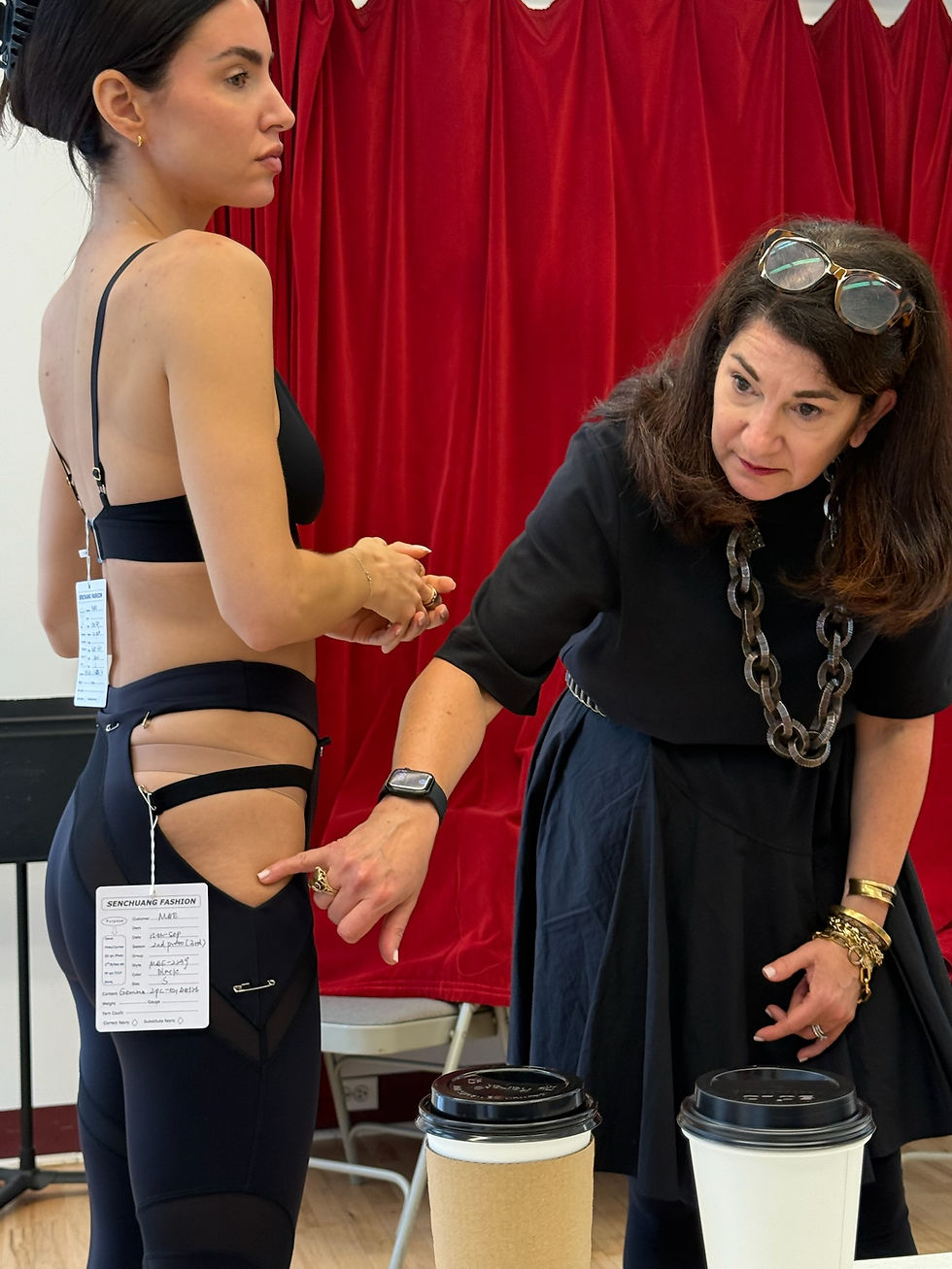
6. The fun begins! Play a little now. Take either the inspo you love or some initial sketches you have (these can literally be chicken scratch drawings mixed with cut out elements from a pic you like). Now put it up to your body and see what you like. Literally you are the canvas so you want to understand how something will look in proportion. Regardless of size or shape, all of us can represent what it will look like on a person. Don’t forget to think about garment size. A large floral might look more interesting cut up on a panty and really ho-hum on a pajama (been there, done that). Conversely, a whimsical print in a bigger scale might get lost on a bra because it’s too cut up to see the intention of the design.
Pro tip: Use a mirror! Throughout the process of print development looking at images, size and/or layout in a mirror really helps a ton. You can often see things about the print in the reflection that you want to adjust much easier rather that when you are looking at it face forward.
7. Business is business Now you’ve got the idea of what you want to design, there is still some final prep prior to beginning the real thing. Development costs money so we want to be wise about it

Paying attention to all of this and discussing with your printer upfront not only saves some re-work later, it also shows your partners you’re respectful of their time. In addition, better for questions to come up early in the creative process versus having to retrofit or redesign your vision later. And the extra bonus is that you get to learn a thing or two along the way.
8. Let the (fashion) games begin! Whether you develop the print yourself in photoshop or are working with a print designer, it's helpful to proceed with a succinct focused direction and a conversation to align at the outset. Hillary Bott Sorrentino; one of my favorite print artists and generally super talented designer, and I work this way every time we partner on a pattern. It gives an opportunity to discuss non-negotiables for the design, development budget and allows time for creative collaboration, prior to pen hitting paper. This includes discussion of deadlines and timeline for development to happen. I’ve found a deliberate kickoff session is helpful in every stage of creative process-not just here. Once you get going, good idea to keep the most pertinent references from this session in front of you or the artist when truly beginning. North Stars are a thing! While it’s great to be spontaneous, for those of us who could inadvertently fly off on a creative tangent, keeping the work that you have accumulated in all prior steps in front of you doesn’t let it veer off too far.
9. Color me Happy-Color makes such a difference to the spirit of a print! I recommend ideating on your colorways in tandem with development of the print itself. Patterns can always be recolored to take on different personalities and can use colors that are off palette. That said, I have found that there needs to be a somewhat obvious tie in to the overall color story you've created for it to make sense. This is super helpful to ensuring that they sit well with the rest of the collection.

Some recent color play
This is a good time to review your research and keep in mind what combos you respond to and what you believe will be most impactful for your story. Was it a particular shade of a green or accent of a neutral in a brightly colored print that toned it down enough to make it more modern? It’s all in the details even here. I’m not going to lie, often this is the most challenging part of print development. Sometimes, just because there are so many good colorways and you have to decide on just one! Also, beware that sometimes it seems as if the slightest tweak will make a colorway even better or save one that’s not working when in fact it's just a point to spin out. So be a little fierce in wading through tweaks and changes.
10. Show Time! After all the previous steps have been taken, the design process should be able to proceed pretty seamlessly. Of course, there will be some back and forth but generally if you’ve prepped up front it’s more about verifying scale, what elements to keep and what ones don’t work.
Few things are more gratifying for designers than seeing their creative vision come to life. Print work is often the thread that pulls a whole collection and palette together, even if it’s actually on just a few pieces within it. And as we all know, when we see a pattern that moves us, we want it! Whether it’s a designer label or a fun find at your favorite local shop prints move us to pick something up and buy it. Even for those of us that spend most of our time solidly moving through the world.

Print work from Uncommon Sense
Stay Tuned for more Behind the Designs articles on Suzy-wakefield.com or @suzywakefielddesigns


Comments